|
|
||||||||||||||||||||||||||||||||||||||||||||||||||||||||||||||||||||||||||||||||||||||||||||||||
Basket Analysis and Market Basket AnalysisCustomers tend to buy a number of items together or separately. Analyzing customer sales shopping basket information can reveal valuable marketing information. Shopping basket analysis is to determine what products customers are buying at the same time on a basket or at different times. It provides opportunities for cross-selling through relevant product recommendations. Product link analysis is to; ... find other products purchased most often along with a particular product?Sales patterns can be analyzed in three levels;
Shopping basket level analysisShopping basket analysis is to find co-relations between products purchased at the same baskets. This uses the following shopping basket data;
Individual customer level analysisCustomer-level shopping pattern data can be prepared as the following example;
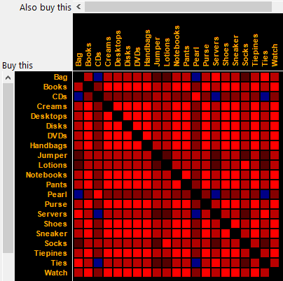
Product Association Analysis - Customer Level AnalysisCMSR product association analysis tools can be used to extract buying patterns;
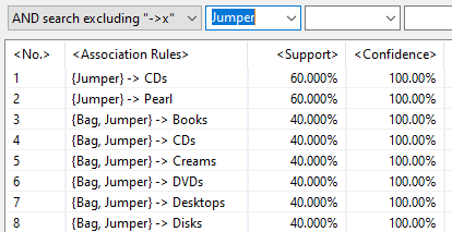
Cells in red color indicate that there is positive relationship between two products. That is, when customers buy one product, they tend to buy the other product as well. Cells in blue color indicate the opposite. When customers buy one product, they tend to not buy the other product. Brightness of cells indicates the relative strength of relationships. Product Association Rules - Basket Level Analysis (Apriori Algorithm)Apriori association rules are alternative method analysing customer buying patterns. Association rules say that n% of customers buying product A also buy product B with m% customers buy product A (=support). The following figure is a CMSR Studio association rules example. A rule is that {buying product(s)} -> {also buying product}.
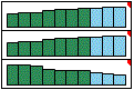
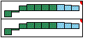
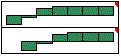
For more on this and downloads, please see CMSR Data Miner / Machine Learning / Rule Engine Studio. Product Sales Trend Similarity Analysis - Timeseries AnalysisThe following figures show seven (product sales) time-series trend charts. Consider the three time-series trends of the left figure. The first two series have identical positive growing trends. As the first series values rise, the second series values also rise. The third has opposite trend. As the values of the first series rises, the values of the third series decrease. This type of co-relationship is very common in business data. These three are correlated! The first and the second are positively correlated. The third is negatively correlated with the first and the second. Now consider the two series of the middle figure. Although not related in linear fashion, two values rise and fall together. That is, they are also closely correlated.
Consider the two series of the right figure. Notice that the second series values resemble the first series values with one period later. That is, one period time shift or time lag pattern. Second pattern occurs after one period lag. This this is also very important co-relationship. Level of correlation can be measured in terms of correlation coefficients. It ranges between -1 and 1. If there is perfectly positive correlation, it is 1. If there is perfectly negative correlation, the value is -1. If no correlation, it is 0. The following chart shows a correlation matrix table of groups/segments. Red color indicates positive correlation. Blue is for negative correlation. Intensity of color is based on (absolute) correlation coefficients. With "Contrast" filters, most important correlations can be identified easily. 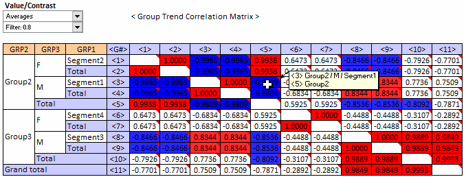
For more on this and excel addin tool downloads, please see Sales Trend Analysis. Download is available from the bottom of the link. |

|
|||||||||||||||||||||||||||||||||||||||||||||||||||||||||||||||||||||||||||||||||||||||||||||||